Choosing a worktop colour is one of the most consequential decisions in any kitchen renovation. The worktop is the largest continuous surface in the room. It sits at eye level, it runs the full length of your kitchen, and it is the surface you interact with every single day. Get it right and it ties everything together. The challenge is that choosing a worktop colour is not as simple as picking something you like. You need to think about how it works with your cabinet colour, your flooring, your lighting, the size of the room, and how the surface will look in five or ten years.
Start with Your Cabinet Colour
Your cabinetry occupies more visual real estate than any other element in the kitchen. Your worktop colour must first and foremost work in harmony with it. There are two main approaches: contrast and complement.
Contrast: Pair a dark worktop with light cabinetry, or a light worktop with dark cabinetry. This creates visual definition and makes both elements feel more intentional. Classic combinations include white shaker cabinets with a jet-black or dark grey quartz worktop, or deep navy cabinetry with a Calacatta-look or pale quartz surface. Contrast works particularly well in kitchens with good natural light.
Complement: Choose a worktop in a tone that is close to, but not identical to, your cabinet colour. This creates a more cohesive, serene feel. Warm cream cabinetry with a warm-veined stone in ivory and gold, for example, feels considered and elegant. The one combination to approach carefully is matching your worktop very closely to your cabinet colour in the same finish. Without contrast in tone or texture, the kitchen can feel flat.
Consider Your Kitchen Size and Natural Light
- In a bright, well-lit kitchen: You have the most flexibility. Both light and dark worktops will perform well. A dark stone on an island in a bright, open kitchen can create a dramatic focal point without making the room feel heavy.
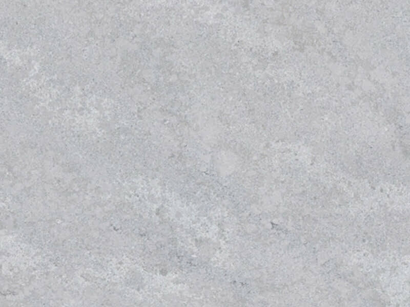
- In a smaller or north-facing kitchen: Light-coloured worktops reflect available light and help the room feel larger and more open. A pale or white quartz worktop will amplify whatever light is present and keep the space feeling open and bright.
- In a kitchen with warm artificial lighting: Warm-toned stones, creams, beiges, and golds, look luxurious under warm light. Cool white or grey stones can feel slightly flat or greenish under certain warm bulb temperatures.
Warm Tones vs Cool Tones
Cool tones include pure whites, blue-greys, charcoal, black, and stones with blue or silver veining. These work well in contemporary, Scandi-inspired, or industrial kitchens and pair naturally with stainless steel appliances.
Warm tones include creams, beiges, warm whites, caramel, tobacco, and stones with gold or brown veining. These work beautifully in traditional, Shaker, or warm minimalist kitchen schemes and pair naturally with brass or bronze hardware. The current direction in UK kitchen design is strongly toward warm tones. If you are renovating in 2025, a warm-toned stone will feel very current and is likely to age well as a design choice.
Light vs Dark Worktops: The Practical Considerations
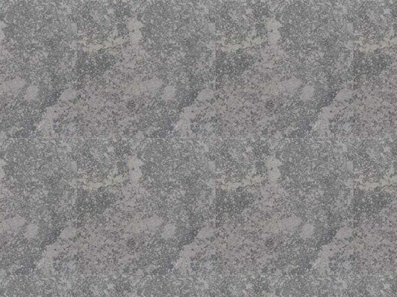
Light worktops show less dust and crumbs between cleaning sessions, but they show water marks, wet rings, and certain types of staining more readily. On polished light stone, fingerprints are visible. Dark worktops show water marks and limescale very clearly, which is a significant practical consideration in hard water areas of the UK. They also show dust and crumbs more visibly than light worktops. However, many surface scratches and minor marks are far less visible on dark stone than on light.
The solution favoured by many customers is a mid-tone stone with movement and veining, which is the most forgiving of all options.
Veined Stone vs Plain Stone
Veined quartz surfaces create visual movement and interest. They look luxurious and tend to be the focal point of a kitchen design. They are also more forgiving of minor marks, because the variation in the surface disguises small imperfections.
Plain or subtly patterned quartz in solid colours creates a cleaner, more architectural feel. These surfaces allow cabinetry and other design elements to stand forward without competing. However, they show water marks and fingerprints more readily.
How to Test Before You Commit
The single most common regret we hear from customers is choosing a worktop colour based on a small sample chip viewed in a showroom and not accounting for how it looks in their own home at full scale.
- Request large samples. A chip the size of a playing card tells you very little about how a stone will look across two metres of kitchen worktop.
- View samples in your own kitchen. Bring them home. Place them against your cabinetry. Look at them in morning light, evening light, and under your kitchen lighting. Colours shift dramatically between contexts.
- Look at full slabs. Before you commit, visit a stone yard and view the actual slabs that will be cut for your kitchen.
- Consider the finish. The same stone in polished and honed finishes can look like almost two different materials.
Popular Worktop Colour Combinations for 2025 UK Kitchens
- White painted Shaker cabinets with warm Calacatta-look quartz. A timeless combination made more interesting with warm gold veining and brass hardware.
- Deep navy or forest green cabinetry with white or pale grey stone. High contrast, highly considered, and very on-trend.
- Natural oak or walnut veneer cabinets with a grey or charcoal stone. The warmth of the wood plays beautifully against a cooler stone surface.
- Soft sage or duck egg blue with a warm grey or greige quartz. A softer, more botanical approach that feels current without being a strong trend statement.
Our Final Advice
There is no universally correct worktop colour. The right choice is the one that works in your specific kitchen, with your specific light, your specific cabinetry, and your specific aesthetic vision. What we consistently see is that customers who take the time to test samples at home, view full slabs, and consider the combination as a whole rather than in isolation make decisions they are happy with for decades.
Explore Our Range
Ready to get started?
Use our instant price calculator for a free estimate, or contact our team for personalised advice.